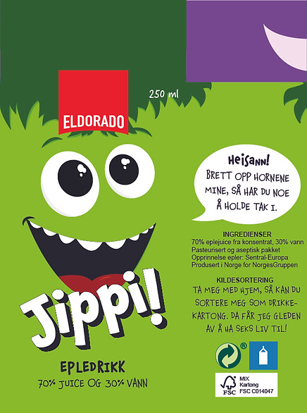
Jippi!
– A rebrand with a fresh design
to score a new marketing position
The task
To redesign a product focusing on the user experience and positioning, while designing a new packaging.


Original
Redesign
The product
Eldorado’s small apple juices are, as of today, produced with an outdated design, with a mascot that is not using its full potential. The placement of the product is out of the children's sight and parent find apple juice, in general, to be too sugary and too bad for their children's teeth. Children have a tendency to press the juice boxes and make a mess.
The Solution
By redesigning Eldorado's apple juice with more water, and with a design that encourages to less mess, we have listened to the parents' wishes. In addition, a new branding architecture and a more attractive visual design will make the product more appealing to children.
3 weeks
Packaging design
Solo
A 4 minute read
Insight
Strategy
Design
INSIGHT
Survey insights
I sent out a survey exploring the users usage and thoughts concerning juice boxes, this specific product, and the brand.
Gains
People have a good relationship with the Eldorado brand: biggest advantage is their price
It’s an easy option to give, since the children love it
It's the right amount of fluid to give when out and about
It's easy to transport in a hurry
Pains
Too much sugar and acid to the parents liking
Eldorado apple juice is less well known than their competitors
When giving it to children it can get messy quickly
STRATEGY
Research question
Through a redesign, how can Eldorado optimize their apple juice for children with health in mind, and how can the packaging design contribute to a more user-friendly product?
Solution
By making the apple juice
70% juice and 30% water,
we are improving the product
to fullfill user needs.
Product concept
Solving pain #1
– Too much sugar and acid
Perk
Buyers already do this at home. We are following Eldorados value, by making their everyday life easier
Challenge
Buyers might feel tricked.
Many companies are experimenting with products like this, so it won't be new to the market. It's not a problem as long as the change is communicated well.
”Thirsty children do not need extra
nutrition, they need water”
– Matportalen
A new name for Eldorados children products
Brand architecture
Solving pain #2
– Being less known then their competitors
Today
the brand is an independent brand. Where Eldorado is produced by Unil, which in turn is produced for NorgesGruppen.
Solution
The apple juice is now called "Jippi!". This is a children's series, but still a part of Eldorado, and is therefore a supported brand.
This has two major advantages
Product Knowledge
What do competitors have, that we don't?
Ah! An easy and attractive name!
A child can easily say "Can I have Kuli?". Our product doesn't have a name, and is most likely just referred to as "apple juice". With a new name, the product will be more aimed at children, and will have a name to go by.
Brand awareness
People already have great brand awareness and relationship with Eldorado. By keeping the brand, consumers will have greater knowledge and confidence in the product.
In a future strategy we could phase out the Eldorado logo and make "Jippi!" an independent brand. This would require a new market analysis after the product is launched.

Product design
Solving pain #3
– Children squeeze the juice box, therefore spilling
Solution
We are keeping the current design of the carton but encourage users to fold out the edges of the box, so the children get a handle to hold.

Translation:
"Hi-ya, fold up my horns, then you have something to hold on to."

Brand position
– A summary
Best in class
X - Factor
Must haves
Encouragement to fold up the corners of the carton to avoid unnecessary spills.
By mixing the apple juice with even more water, Eldorado's apple juice is the best apple juice to drink in everyday life.
- Drinkable amount for small children
- Packaging so it can be used on the go
- Ordinary apple juice without artificial sweeteners. Sweeteners aren't recommended for children under the age of three
DESIGN
Design goals
- It has to be appealing for both children and buyers
- It has to convey that you can fold the edges
- It has to convey the new water juice ratio
Sketches
To better understand the target group and their imagination, I have asked three children (ages 3, 9 and 11) to make apple figure drawings.
My personal favorite is
the one with sunglasses!
Process


End result

 |
|---|
 |
 |
 |
 |
 |
 |
 |
 |
All in all!

70% juice + 30% water
A healthier juice so parents don't have to be worried about too much sugar and acid, therefore making it possible to drink more often
New position
The already loved brand Eldorado now has great potential to push their children's serie, with a name that is easier to say for children
Less mess
Now parents can enjoy giving their child a juice box with handles, without being worried about the child squeezing too hard
New mascot
A fresh and modern design gives Eldorado the boost it needs to keep up with the time, so that they keep being appealing to the buyers as well
Recycle
By communicating how many more lives this juice box has left, we can tell children why it’s important to recycle
P.S.
I want to acknowledge the MiN apple juice design created by Opudi, which looks the same as my redesign. My work was done before the release of this product.
I choose to look at this as proof that my design would work "in the real world", and not only as a school exam.
Thank you for looking at this project!

